Customer Churn_Modelling
Targeting Customers:
Using an Artificial Neural Network to Identify Target Groups and Improve Customer Retention
Gabriel Guerrero and Steven Swensen
Introduction
A bank in Europe has clients across Germany, Spain, and France. Despite the international reach, the company has been losing customers. In order to prevent further churn, the company has decided to identify who is leaving the company in order to remind them of the exceptional service that they provide the customer. The bank has provided customer information, and from this, we will derive key variables in order to help the bank with their problem.
Using exploratory data analysis, we identify key variables and patterns that help us find relationships in the data that could tell us which customers are leaving. Additionally, we determine what tools best accomplish our task and develop a model that is accurate, reliable, and predictable, and report our results.
We used seaborn library utilities to produce a pairplot across all of our features to see if we could identify any obvious relationships. Because we planned to use a neural network and since several of our features differed by several orders of magnitude, we created new standardized and normalized feature sets from our raw data.
Next, using a heatmap we examined correlation between features in our raw data and our normalized/standardized data. Finding some interesting apparent relationships in the pairplot and heatmaps we utilized distribution plots and scatterplots to further examine those features. Afterwards, we decided that no useful linear relationships for classification existed among the features. So we concluded a neural network indeed seemed to be the best tool to proceed further since it can find or learn complex nonlinear relationships.
Libraries Used
# Load Pandas for scientific datastructures and numeric methods
import pandas as pd

# Load seaborn, matplot for visualization
import seaborn as sns
import matplotlib.pyplot as plt
from matplotlib import rcParams
%matplotlib inline

#Load sklearn dataset split and model metric reporting
from sklearn.model_selection import train_test_split
from sklearn.preprocessing import MinMaxScaler
from sklearn.metrics import classification_report
from sklearn.metrics import confusion_matrix

#Load Tensorflow, keras  for Neural network model architechture, modeltraining and performance metrics
import tensorflow as tf
from tensorflow.keras.models import Sequential
from tensorflow.keras.layers import Dense, Activation
from tensorflow.keras.callbacks import EarlyStopping
from tensorflow.keras.layers import Dropout
from keras.utils.vis_utils import plot_model

#for neural network architecture visualization
import pydot
import graphviz
Data Acquisition and Preparation
Our data came from Super Data Science (https://www.superdatascience.com/pages/deep-learning) via Kaggle.
It was put together in 2018 for a course on Machine Learning by Kirill Eremnko and Hadelin de Ponteves. The data was manufactured for the course, and is not reflective of real-world human behavior.
We downloaded the dataset from the website and, upon examining, decided it didn’t need any further work. info() method has ccounted for all 10,000 non-null values, which means that it found no null values. If it did, it would note the discrepency as a number less than 10,000. No odd rows had to be filtered, no obvious data anomalies .
#Loading 'bank' provided data  into a data frame
df = pd.read_csv('Churn_Modelling.csv')

#display header
df.head(5)
| RowNumber | CustomerId | Surname | CreditScore | Geography | Gender | Age | Tenure | Balance | NumOfProducts | HasCrCard | IsActiveMember | EstimatedSalary | Exited | |
|---|---|---|---|---|---|---|---|---|---|---|---|---|---|---|
| 0 | 1 | 15634602 | Hargrave | 619 | France | Female | 42 | 2 | 0.00 | 1 | 1 | 1 | 101348.88 | 1 |
| 1 | 2 | 15647311 | Hill | 608 | Spain | Female | 41 | 1 | 83807.86 | 1 | 0 | 1 | 112542.58 | 0 |
| 2 | 3 | 15619304 | Onio | 502 | France | Female | 42 | 8 | 159660.80 | 3 | 1 | 0 | 113931.57 | 1 |
| 3 | 4 | 15701354 | Boni | 699 | France | Female | 39 | 1 | 0.00 | 2 | 0 | 0 | 93826.63 | 0 |
| 4 | 5 | 15737888 | Mitchell | 850 | Spain | Female | 43 | 2 | 125510.82 | 1 | 1 | 1 | 79084.10 | 0 |
# Checking for NaN and other anomalies
df.info()
    <class 'pandas.core.frame.DataFrame'>
    RangeIndex: 10000 entries, 0 to 9999
    Data columns (total 14 columns):
     #   Column           Non-Null Count  Dtype
    ---  ------           --------------  -----
     0   RowNumber        10000 non-null  int64
     1   CustomerId       10000 non-null  int64
     2   Surname          10000 non-null  object
     3   CreditScore      10000 non-null  int64
     4   Geography        10000 non-null  object
     5   Gender           10000 non-null  object
     6   Age              10000 non-null  int64
     7   Tenure           10000 non-null  int64
     8   Balance          10000 non-null  float64
     9   NumOfProducts    10000 non-null  int64
     10  HasCrCard        10000 non-null  int64
     11  IsActiveMember   10000 non-null  int64
     12  EstimatedSalary  10000 non-null  float64
     13  Exited           10000 non-null  int64
    dtypes: float64(2), int64(9), object(3)
    memory usage: 1.1+ MB
| Column Name | Date Type | Description |
|---|---|---|
| CreditScore | int64 | Range 340-850 , industry standard credit/financial responsibility rting |
| Geography | String | Customer country of residence |
| Gender | Char | Male or Female |
| Age | int64 | Age of the customer |
| Tenure | int64 | Number of years the customer has held an account |
| Balance | float64 | The Euro balance held in the account |
| NumOfProducts | int6 | Number of bankservices used by customer |
| HasCrCard | int64 Binary (0,1) | Indicating whether a Credit card is associated with account |
| IsActiveMember | int64 Binary (0,1) | Indicating whether the account is presently active |
| EstimatedSalary | float64 | Estimated annual salary in Euros earned by account holder. |
| Exited | int64, Binary (0,1) | Indicating whether the customer has terminated their elationship with the bank. |
*unused features were not included in the table
10,000 instance in all 14 columns. All instances are accounted for with no NaN’s present. Our data appears clean and ready for analysis.
Exploratory Data Analysis
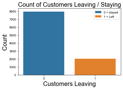
Exited
2037 out of 10,000 customers left, which is about 20%.
At first, this seemed significant. However, the length of time over which this customer loss happened isn’t given in the data set. While 20% customer loss is bad for a business, it may not be that much for the model to learn from.
#count of customers who stayed and who left
print('Number of People that Exited\n-----------------------')
df.Exited.value_counts()
    Number of People that Exited
    -----------------------
    0    7963
    1    2037
    Name: Exited, dtype: int64
#Count of People That Exited
fig = sns.countplot(data = df, x = 'Exited', hue = "Exited", dodge = False)
fig.set_title(label = "Count of Customers Leaving / Staying", fontsize = 20)

fig.legend(labels = ['0 = stayed' , '1 = Left'],
           fontsize = 'medium', title_fontsize = 20)

fig.set_xlabel('Customers Leaving', fontsize = 20 )
fig.set_ylabel('Count', fontsize = 20)

sns.set(rc = {'figure.figsize':(15, 10)})
plt.show()
Age
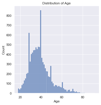
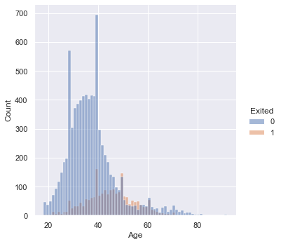
If we look at the distribution of age, we can immediately notice three prominent spike’s in membership around ages 27, 40, and 49.
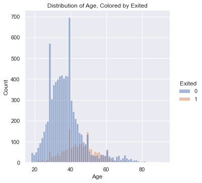
If we look at the second histogram, which is hued by “Exited”, we can see a percentage of those who left the company are from the same spikes in membership enrollment.
This means that people within these age demographics are enrolling in big numbers and a certain percentage of them are leaving.
The percentage of people signing up and then leaving isn’t huge, but there’s a match.
#get distribution of age
fig = sns.displot(data = df, x = 'Age')
fig.set(title =  "Distribution of Age")

plt.show()
#distribution of age, hued by exited
#problems seem to be for the 40-50 age group

fig = sns.displot(data = df, x = 'Age', hue = 'Exited')
fig.set(title =  "Distribution of Age, Colored by Exited")

plt.show()
Active Member
Only about 27% of inactive members left. Of course, we could expect inactive memebers to leave at a greater rate than active memebers since inactive memebers aren’t using the bank’s services. However, considering a totl of 20% of the customer base left, 27% of inactive memebers leaving doesn’t seem significant when compared to the 14.5% of active memebers that left. It begs the question: why did close to 15% of active memebers leave?
#barplot of percentage of active members
fig = sns.barplot(data = df, x = ‘IsActiveMember’, y = ‘Exited’, ci = None, hue = ‘IsActiveMember’, dodge = False) fig.set_title(label = “Percentage of Active Members Who Left”, fontdict = {‘fontsize’ : 20})
fig.legend(labels = [‘0 = Inactive Member’ , ‘1 = Active’], fontsize = ‘large’, title_fontsize = 20)
fig.set_xlabel(‘Active Member’, fontsize = 20 ) fig.set_ylabel(‘Exited’, fontsize = 20)
#sns.set(rc = {‘figure.figsize’:(15, 10)})
plt.show()
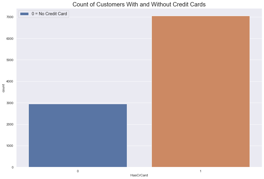
Has Credit Card
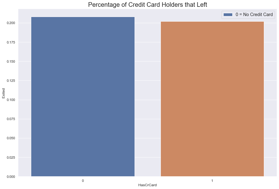
More customers have a credit than don’t. Within this category, both types of customers are leacing at roughly the same rate.
However, because there are more people with credit cards that without, people with credit cards are leaving in greater numbers.
#barplot of percentage of customers with credit cards
fig = sns.barplot(data = df, x = 'HasCrCard', y = 'Exited', ci = None)
fig.set_title(label = "Percentage of Credit Card Holders that Left", fontdict = {'fontsize' : 20})

fig.legend(labels = ['0 = No Credit Card' , '1 = Credit Card'],
           fontsize = 'large', title_fontsize = '50')
sns.set(rc = {'figure.figsize':(15, 10)})
plt.show()
#count of customers with credit cards
fig = sns.countplot(data = df, x = 'HasCrCard')
fig.set_title(label = "Count of Customers With and Without Credit Cards", fontdict = {'fontsize' : 20})

fig.legend(labels = ['0 = No Credit Card' , '1 = Credit Card'],
           fontsize = 'large', title_fontsize = '50')
sns.set(rc = {'figure.figsize':(15, 10)})
plt.show()
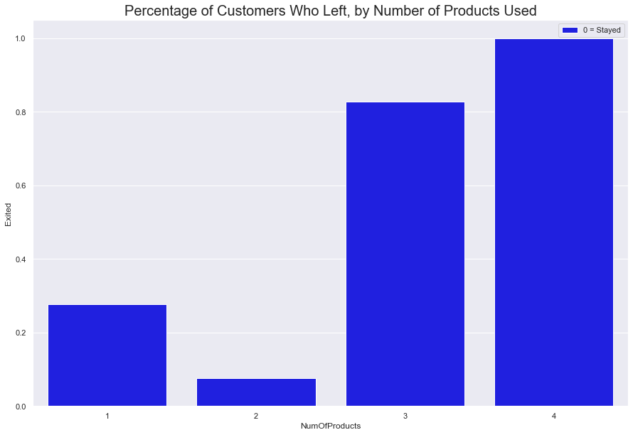
Number of Accounts
This is a trick of percentages. 100% of memebers with 4 accounts left. However, this is because a statistically insignificant amount of the customer base even had four accounts.
Close to 1500 of the customers with one account left, while a little over 400 with 2 accounts left. Considering 2,037 of the total customers base left, we can conclude that majority of the customers that left had one to two accounts
#count of customers that used 1-4 accounts, hued by Exited.

fig = sns.countplot(data = df, x = 'NumOfProducts', hue = 'Exited')
fig.set_title(label = "Number of Customers with One or More Accounts", fontdict = {'fontsize' : 20})

fig.legend(labels = ['0 = Stayed' , '1 = Left'],
           fontsize = 'large', title_fontsize = '50')

sns.move_legend(fig, loc = 'upper right')

sns.set(rc = {'figure.figsize':(15, 10)})
plt.show()
---------------------------------------------------------------------------

NameError                                 Traceback (most recent call last)

~\AppData\Local\Temp/ipykernel_7336/4227347872.py in <module>
      1 #count of customers that used 1-4 accounts, hued by Exited.
      2
----> 3 fig = sns.countplot(data = df, x = 'NumOfProducts', hue = 'Exited')
      4 fig.set_title(label = "Number of Customers with One or More Accounts", fontdict = {'fontsize' : 20})
      5


NameError: name 'sns' is not defined
#barplot of percentage of customers that Exited.

fig = sns.barplot(data = df, x = 'NumOfProducts', y = 'Exited', ci = None, color = 'Blue' )
fig.set_title(label = "Percentage of Customers Who Left, by Number of Products Used", fontdict = {'fontsize' : 20})

fig.legend(labels = ['0 = Stayed' , '1 = Left'],
           fontsize = 'large', title_fontsize = '50')

sns.move_legend(fig, loc = 'upper right')

sns.set(rc = {'figure.figsize':(15, 10)})
plt.show()
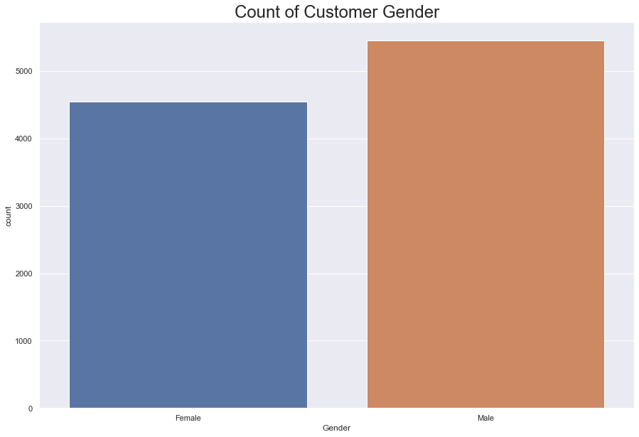
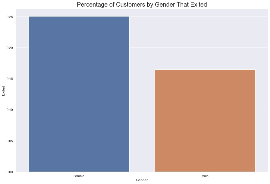
Gender
There are 4543 women and 5457 men with accounts at this bank.
Around 25% of women left and rougly 16% of men left; that is, 1135 women left, while 928 men left, which is a total 2063 people that left.
#count of gender

print('Number of Men and Women \n-------------------------')
df.Gender.value_counts()
Number of Men and Women
-------------------------
Male      5457
Female    4543
Name: Gender, dtype: int64
#countplot of gender
fig = sns.countplot(data = df, x = 'Gender')
fig.set_title(label = "Count of Customer Gender", fontdict = {'fontsize': 24})

sns.set(rc = {'figure.figsize':(15, 10)})
plt.show()
#Count of people that Exited by Gender
fig = sns.barplot(data = df, x = 'Gender', y = 'Exited', ci = None)
fig.set_title(label = "Percentage of Customers by Gender That Exited", fontdict = {'fontsize' : 20})

sns.set(rc = {'figure.figsize':(15, 10)})
plt.show()
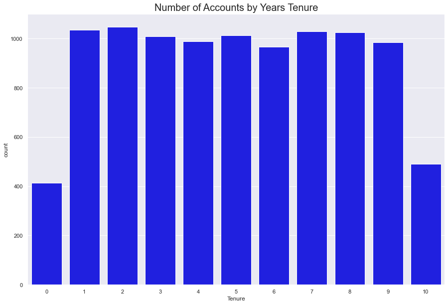
Tenure
The count of tenure seems to be evenly spread between 1-9 years. That is to say, roughly 950-1000 people last between one to nine years, each year.
400 people last lest than year, and roughly 500 last 10 years.
When looking at the count of people who exited within the tenure plot, there doesn’t seem to be any immediate correlation between length of tenure and exiting. The bank loses people at a seemingly constant rate within each tenure category.
#countplot of tenure plotted with countplot of "Exited" and the the length of their tenure

fig = sns.countplot(data = df, x = 'Tenure', color = 'Blue')
fig.set_title(label = "Number of Accounts by Years Tenure", fontdict = {'fontsize' : 20})

sns.set(rc = {'figure.figsize':(15, 10)})
plt.show()
#same as cell above, hued by Exited
fig = sns.countplot(data = df, x = 'Tenure', hue = 'Exited')
fig.set_title(label = "Number of Accounts Lost or Retained by Years Tenure", fontdict = {'fontsize' : 20})
fig.legend(labels = ["Stayed", "Exited"])
fig.set_ylabel(ylabel = "Number of Accounts")
sns.set(rc = {'figure.figsize':(15, 10)})
plt.show()
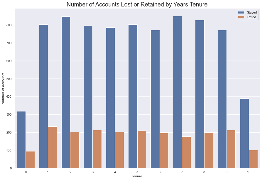
#numeric breakdown of tenure, then Exited by tenure
tenure  = df.groupby(by = 'Tenure')
tenure.Exited.value_counts()
Tenure  Exited
0       0         318
        1          95
1       0         803
        1         232
2       0         847
        1         201
3       0         796
        1         213
4       0         786
        1         203
5       0         803
        1         209
6       0         771
        1         196
7       0         851
        1         177
8       0         828
        1         197
9       0         771
        1         213
10      0         389
        1         101
Name: Exited, dtype: int64
%%html
<!-- html code shifts table in below cell to the left -->
<style>
table {float:left}
</style>
| Tenure | Number of Total Members | Number That Left | Percentage That Left |
|---|---|---|---|
| 0 | 413 | 95 | 23% |
| 1 | 1035 | 232 | 22.4% |
| 2 | 1048 | 201 | 19% |
| 3 | 1009 | 213 | 21% |
| 4 | 989 | 203 | 20.5% |
| 5 | 1012 | 209 | 20.6% |
| 6 | 967 | 196 | 20.2% |
| 7 | 1028 | 177 | 17% |
| 8 | 1025 | 197 | 19% |
| 9 | 984 | 213 | 21.6% |
| 10 | 490 | 101 | 20.6% |
This bank regularly loses between 19% - 22% of its clients
There is no association between a client’s tenture and whether or not they will stay.
Another variable must be able to predict whether or not the bank will lose a client.
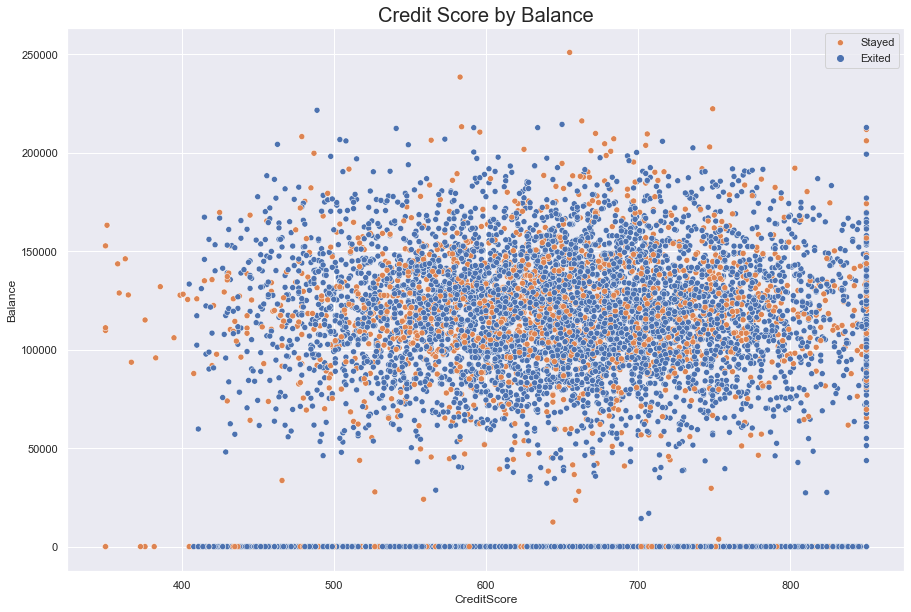
Looking At Salaries and Balances and Credit Scores
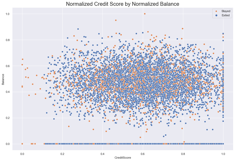
How does one’s financial situation affect their decision to leave? It’s possible that one’s credit score could inspire a customer to leave their present institution if a rival offered them a better deal, based on their score.
In the graph below, we looked at customers’ financial behavior by comparing Credit Score against Balance and hueing for Exited. The scatter did not reveal any linear relationships, such as positive slope between higher credit scores and higher on-hand bank balances.
Across the credit score spectrum, the graph revealed that people are going to have nothing in the bank regarldess of how well they manage their credit. As well, people with the highes score will span the on-hand balance spectrum.
Although we can identify a few clusters of people who left, such as at the 625 score mark (just below an on-hand balance of $150,000) nothing definitive shows up in the scatterplot.
#scatter plot of CreditScore against Balance, hued by Exited

fig = sns.scatterplot(data = df, x = 'CreditScore', y = 'Balance', hue = 'Exited')
fig.set_title(label = "Credit Score by Balance", fontdict = {'fontsize' : 20})
fig.legend(labels = ["Stayed", "Exited"])
sns.set(rc = {'figure.figsize':(15, 10)})

plt.show()
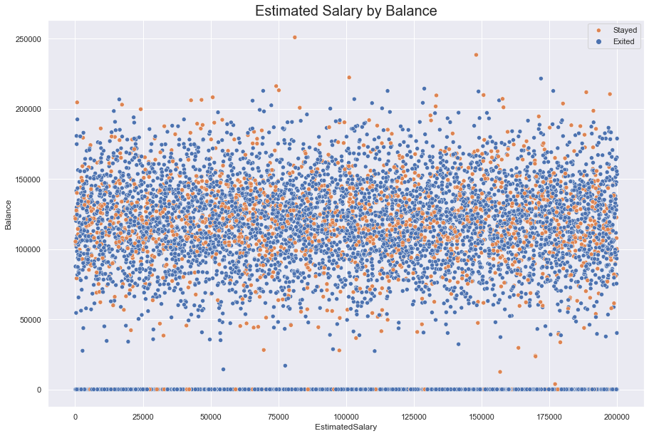
A clearer band appears when Estimated Salary is measured against Balance. The data seems to be bound between 150,000 and 90,000. This could reflect savings goals; it is not, however, enough to identify a clear relations with a customer’s salary.
Further, despite a few clusters, no clear signal emerges for Exited.
#scatter plot of EstimatedSalary against Balance, hued for Exited
fig = sns.scatterplot(data = df, x = 'EstimatedSalary', y = 'Balance', hue = 'Exited')

fig.set_title(label = "Estimated Salary by Balance", fontdict = {'fontsize' : 20})
fig.legend(labels = ["Stayed", "Exited"])
sns.set(rc = {'figure.figsize':(15, 10)})

plt.show()
Standardizing the Data
Next, we standardized and then normalized the data to see if we could see any linear relationship that might be hidden.
Ultimately, we concluded that Normilzation had the most logical use for our data since it oriented the data around the difference between the max and min rather than standard deviation. We felt normalization handled the range of data better than standardization.
#create function to standardize data

def standardize(data):
    stand = (data - data.mean())/data.std()
    return stand
#apply balance to function to test functionality
x = df['Balance']

standard_balance = standardize(x)
#passing Credit Score column into function

standard_score = standardize(df.CreditScore)
Normalizing the Data
X_new = (X — X_min)/ (X_max — X_min)
#function to normalize data.

def Normalize(data):
    norm = (data - data.min())/(data.max() - data.min())
    return norm
#normalize balance
norm_bal = Normalize(df.Balance)
#normalize credit score
norm_score = Normalize(df.CreditScore)
#scatterplot: Normalized Credit Score against Normalized Balance

fig = sns.scatterplot( data = df, x= Normalize(df.CreditScore), y = Normalize(df.Balance), hue = 'Exited')

fig.set_title(label = "Normalized Credit Score by Normalized Balance", fontdict = {'fontsize' : 20})
fig.legend(labels = ["Stayed", "Exited"])
sns.set(rc = {'figure.figsize':(15, 10)})

plt.show()
#normalizing and standardizing Estimated Salary
norm_sal = Normalize(df.EstimatedSalary)
stand_sal = standardize(df.EstimatedSalary)
#adding normalized and standardized data to the data frame

df['Normalized_Credit_Score'] = norm_score
df['Normalized_Balance'] = norm_bal
df['Standardized_Credit_Score'] = standard_score
df['Standardized_Balance'] = standard_balance
df['Normalized_Salary'] = norm_sal
df['Standardized_Salary'] = stand_sal
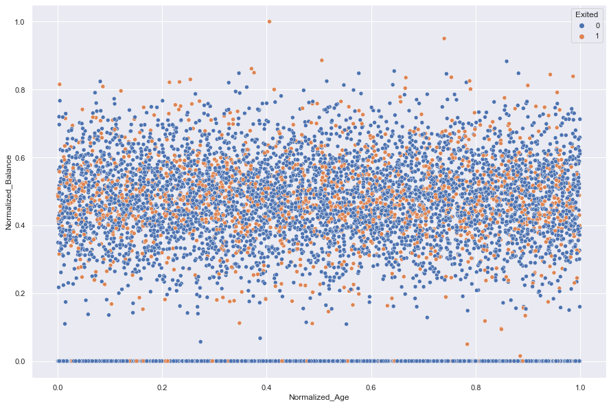
It appears that neither Standardization nor Normalization revealed any hidden relationships in the data when Age was plotted against Balance
#comparing normalized and standardized Age against Balance, hueing for Exited

norm_age = Normalize(df.EstimatedSalary)
stand_age = standardize(df.EstimatedSalary)

df['Normalized_Age'] = norm_age
df['Standardized_Age'] = stand_age

sns.scatterplot(data = df, x = 'Normalized_Age', y = 'Normalized_Balance', hue = 'Exited')
plt.show()


sns.scatterplot(data = df, x = 'Standardized_Age', y = 'Standardized_Balance', hue= 'Exited')
plt.show()


#look at Standardized_Balance 1.2 to see what's going on.

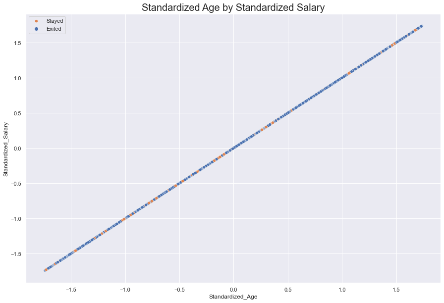
However, a hidden linear relationship emerged when Standardized Age was plotted against Standardized Salary.
This only told us that as one ages, they earn more.
#display standardized linear plot of Age against Salary
fig = sns.scatterplot(data = df, x = 'Standardized_Age', y = 'Standardized_Salary', hue = 'Exited')

fig.set_title(label = "Standardized Age by Standardized Salary", fontdict = {'fontsize' : 20})
fig.legend(labels = ["Stayed", "Exited"])
sns.set(rc = {'figure.figsize':(15, 10)})

plt.show()
#display normalized salary against normalized balance

fig = sns.scatterplot(data = df, x = 'Normalized_Salary', y = 'Normalized_Balance', hue = 'Exited')

fig.set_title(label = "Normalized Salary by Normalized Balance", fontdict = {'fontsize' : 20})
fig.legend(labels = ["Stayed", "Exited"])
sns.set(rc = {'figure.figsize':(15, 10)})

plt.show()
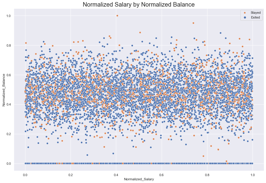
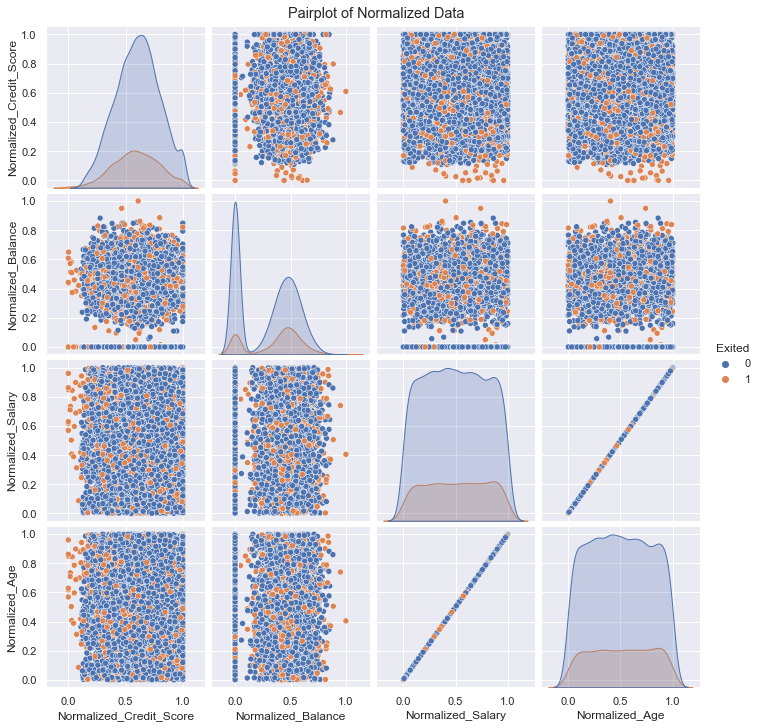
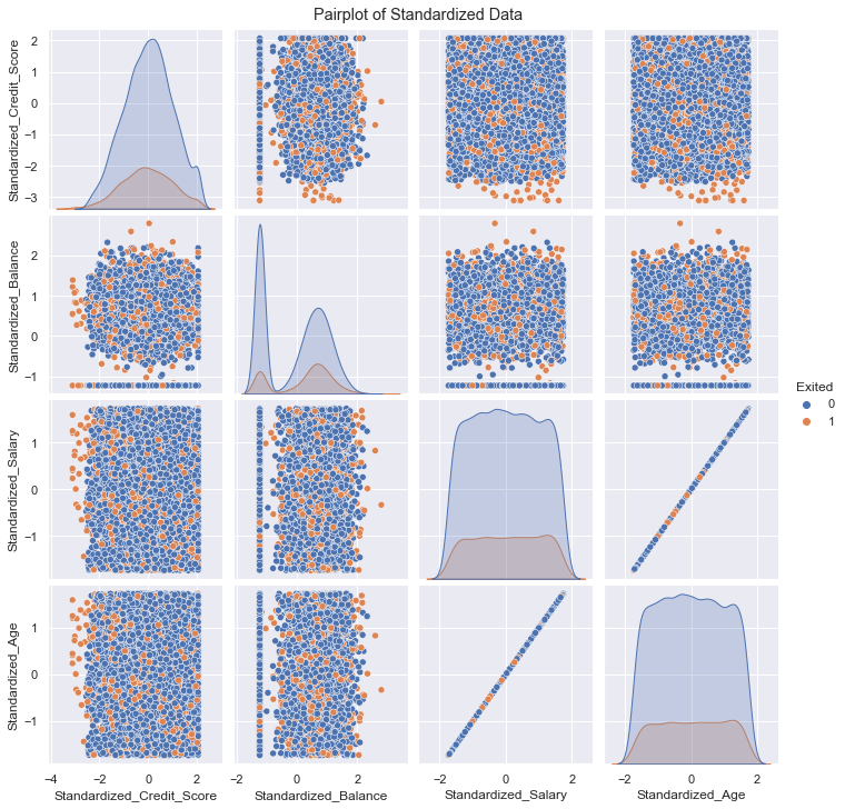
Unfortunately, our data transformation did not yield any additional insights that we had hoped for. We only produced more plots that are cluttered with noise. With the exception of normalized and standardized salary against age (as explained above), no plots revealed any relationships within the data. All the data remain non-linear.
#pairplot to get a quick overview of the how normalization and standardization performed.


filter_col = [col for col in df if col.startswith('Normal')]
filter_col.append('Exited')

normalized = df[df.columns[pd.Series(df.columns).str.startswith('Normal')]]
normalized = df[filter_col]

fig1 = sns.pairplot(normalized,vars= df.columns[pd.Series(df.columns).str.startswith('Normal')], hue= 'Exited')
fig1.fig.suptitle("Pairplot of Normalized Data", y = 1.01)

plt.show()

filter_col = [col for col in df if col.startswith('Standard')]
filter_col.append('Exited')
standardized = df[df.columns[pd.Series(df.columns).str.startswith('Standard')]]
standardized = df[filter_col]

fig2 = sns.pairplot(standardized,vars= df.columns[pd.Series(df.columns).str.startswith('Standard')], hue= 'Exited')
fig2.fig.suptitle("Pairplot of Standardized Data", y =1.01)

plt.show()
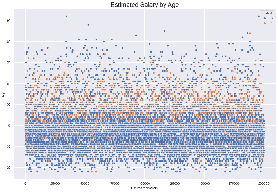
The EstimatedSalary and Age, as seen below, appears to have a non-linear relationship. This is because of the scale of the Estimated Salary is three orders of magnitude greater than that of age. So in this comparison the distribution of salary dominates and the linear relationship is not immediately obvious to the observer.
While the scatter plot below seems to suggest that Exiters dominate ages 50-60 , another graph can show us that this is more than likely an illusion. From the histogram below, we can see that in the age range 50-60, neither Exiters nor non-Exiters truly domiante one another. They appear to be evenly split except for a few instances where Exiters pull ahead.
#reviewing scatterplot and age distribution to demonstrate the signal that wasn't a signal

fig = sns.scatterplot(data = df, x = 'EstimatedSalary', y = 'Age', hue ='Exited') #increase the figure size so the numbers are readable
fig.set_title(label = 'Estimated Salary by Age', fontsize = 20)
sns.displot(data = df, x = 'Age', hue = 'Exited') #work on readability of the graph.
<seaborn.axisgrid.FacetGrid at 0x14243d18eb0>
Looking At Region
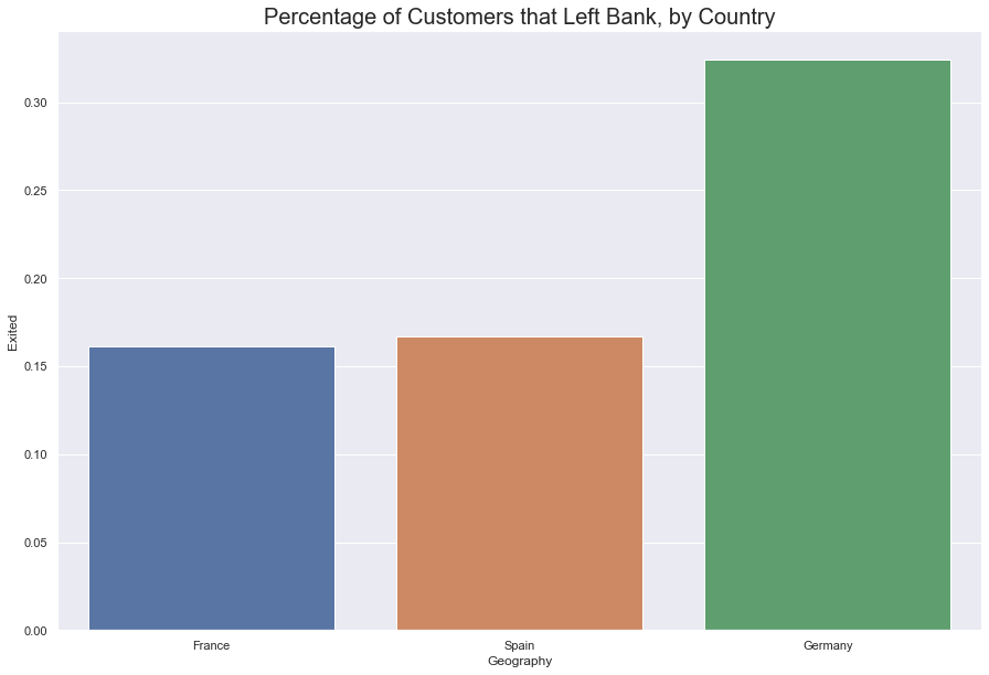
Given that this is an international bank (within the confines of Europe) it’s worth looking at if the bank is losing customers to native competition.
The French made up roughly fifty percent of the company’s customer base. Germnay and France were split evenly along twenty-five percent.
About 30% of German’s left the company, while roughly 17% of customers from France and Spain each left the company. In this case, Germans not only left at a greater percentage, but even in greater numbers. 878 Germans left while only 802 French left. Germans make up the strongest group that are leaving and perhaps present the strongest signal so far as to who our target customer is.
#get count of bank customers by country

print('Number of Customers by Country\n--------------------------')
df.Geography.value_counts()
Number of Customers by Country
--------------------------


France     5014
Germany    2509
Spain      2477
Name: Geography, dtype: int64
#count of customers from each country that left

fig = sns.barplot(data = df, x='Geography', y= 'Exited', ci = None)
fig.set_title(label = "Percentage of Customers that Left Bank, by Country", fontdict = {'fontsize' : 20})


sns.set(rc = {'figure.figsize':(15, 10)})
plt.show()
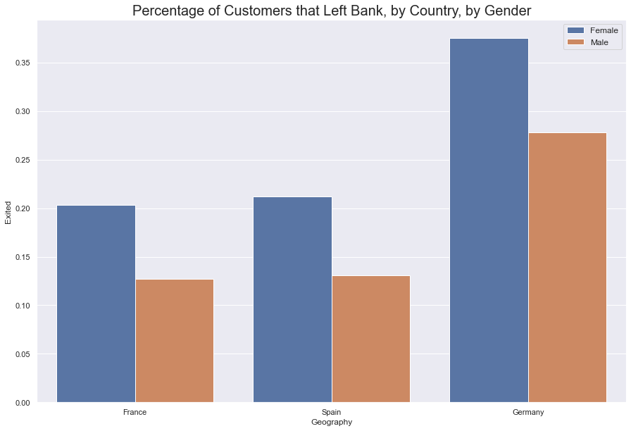
While it’s easy to theorize that the company should focus its efforts on retaining German Women, two simple associations is not enough to make this conclusion.
As was seen above, the financial relationships could not be easily investigated. Artificial Neural Networks can help pick through the non-linear data and provide more insight into who our disastified customers are.
#at what rate did each gender leave from specific countries
fig = sns.barplot(data = df, x='Geography', y= 'Exited', hue = 'Gender', ci = None)
fig.set_title(label = "Percentage of Customers that Left Bank, by Country, by Gender", fontdict = {'fontsize' : 20})

fig.legend(fontsize = 'medium')

sns.set(rc = {'figure.figsize':(15, 10)})
plt.show()
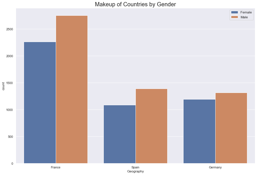
#what was the international make up of the bank's customer base.

fig = sns.countplot(data = df, x = 'Geography', hue = 'Gender')

fig.set_title(label = "Makeup of Countries by Gender", fontdict = {'fontsize' : 20})

fig.legend(fontsize = 'medium')

sns.set(rc = {'figure.figsize':(15, 10)})
plt.show()
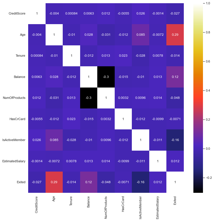
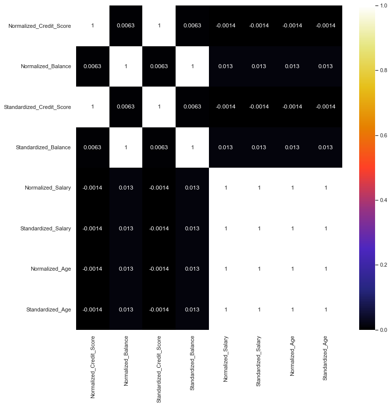
Heatmap
Lastly, we plotted a heatmap to find any correlations among the entire data set.
dfcorr removes the normalization and standardization, row number and customer id. dfcorr2 only displays the normalized and standardized data.
No strong correlations emerged in the data except for what was previously seen in the Normalized and Standardized Age against Salary.
#remove standardized and normalized data, row number, and customer id
dfcorr = df.drop(['RowNumber', 'CustomerId', 'Normalized_Credit_Score', 'Normalized_Balance','Normalized_Salary', 'Normalized_Age',
                  'Standardized_Credit_Score', 'Standardized_Balance', 'Standardized_Salary', 'Standardized_Age'],
                axis = 1)
dfcorr = dfcorr.corr()
plt.figure(figsize = (12, 12))

sns.heatmap(dfcorr, annot = True, cmap = 'CMRmap')
<AxesSubplot:>
#map only standardized and normalized data
dfcorr2 = df.drop(['RowNumber', 'CustomerId', 'NumOfProducts', 'Exited',
                   'CreditScore','Age', 'EstimatedSalary', 'Balance','CreditScore',
                   'Tenure', 'HasCrCard','IsActiveMember'], axis = 1)
dfcorr2 = dfcorr2.corr()
plt.show()
plt.figure(figsize = (12, 12))

sns.heatmap(dfcorr2, annot = True, cmap = 'CMRmap')
<AxesSubplot:>
Final Data Set
Using Artificial Neural Networks
Finalized Dataset
This dataset will contain one-hot encoded features from Geography and Sex. One-hot encoding is a binary representation of engineered features derived from categorical data.
#transform string data into binary data

sex = pd.get_dummies(df['Gender'], drop_first = True)
geo = pd.get_dummies(df['Geography'])
#create new dataframe

df2 = pd.concat([df[['CreditScore', 'Age', 'EstimatedSalary', 'IsActiveMember', 'HasCrCard','NumOfProducts']],
                 sex, geo], axis = 1)
#display final dataframe
df2.head(5)
| CreditScore | Age | EstimatedSalary | IsActiveMember | HasCrCard | NumOfProducts | Male | France | Germany | Spain | |
|---|---|---|---|---|---|---|---|---|---|---|
| 0 | 619 | 42 | 101348.88 | 1 | 1 | 1 | 0 | 1 | 0 | 0 |
| 1 | 608 | 41 | 112542.58 | 1 | 0 | 1 | 0 | 0 | 0 | 1 |
| 2 | 502 | 42 | 113931.57 | 0 | 1 | 3 | 0 | 1 | 0 | 0 |
| 3 | 699 | 39 | 93826.63 | 0 | 0 | 2 | 0 | 1 | 0 | 0 |
| 4 | 850 | 43 | 79084.10 | 1 | 1 | 1 | 0 | 0 | 0 | 1 |
Train/Test Split
X = df2.values

y = df['Exited'].values
#split data into x and y test sets
#test_size set to 30% of data set

x_train, x_test, y_train, y_test = train_test_split(X, y, test_size = 0.3, random_state = 50)
#create instance of MinMaxScaler
scaler = MinMaxScaler()
#transform x_train data
scaler.fit(x_train)
MinMaxScaler()
#transform data using normalization formula

x_train = scaler.transform(x_train)
x_test = scaler.transform(x_test)
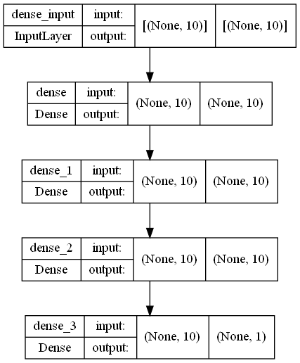
#create neural network mode with an input layer, two hidden layers with relu activations
#and one output layer with sigmoid activation function to output binary data

#activation in first three layers set to relu.
#Relu introduces linearity without a gradient vanishing problem for complex problems

#sigmoid function will ouptut the calculations into a range between 0 and 1, appropriate for binary classification.
#the shape of the output gives a strong signal to one classification or the other

model = Sequential([
Dense(10, input_shape = (10,), activation = 'relu'),
Dense(10, activation = 'relu'),
Dense(10, activation = 'relu'),
Dense(1, activation = 'sigmoid'),
])
#print out of neural network architecture summary
model.summary()
Model: "sequential"
_________________________________________________________________
 Layer (type)                Output Shape              Param #
=================================================================
 dense (Dense)               (None, 10)                110

 dense_1 (Dense)             (None, 10)                110

 dense_2 (Dense)             (None, 10)                110

 dense_3 (Dense)             (None, 1)                 11

=================================================================
Total params: 341
Trainable params: 341
Non-trainable params: 0
_________________________________________________________________
#requires graphviz and pydot and a graphviz executable in order to run
# https://forum.graphviz.org/t/new-simplified-installation-procedure-on-windows/224
#import pydot
#import graphviz

#print out of neural network architecture summary
plot_model(model, to_file='model_plot.png', show_shapes=True, show_layer_names=True)
#set optimizer to rms propogation, a method of taking a moving average to keep the overall learning momentum at a steady rate.
#rmsprop keeps our model from getting stuck in a gradient

#set loss to binary crossentropy(bce).
#BCE calculates the probability of the classification and the loss between the subsequent predicted probabilities

#set metrics to accuracy to see predictive performance of our model

model.compile(optimizer = 'rmsprop', loss ='binary_crossentropy', metrics = ['accuracy'])
Scenario 1
#fit to model
#600 epochs chosen at random

model.fit(x = x_train,
         y = y_train,
         epochs = 600,
         validation_data = (x_test, y_test),
         verbose = 1)
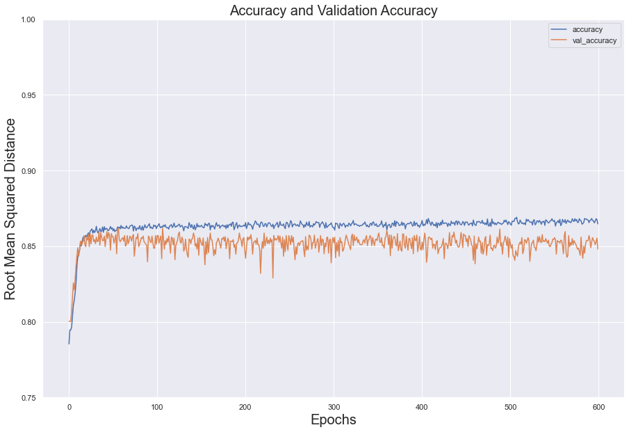
In the test set, the loss value decreased steadily over the epochs; however, validation loss flattened at around 100 epochs. The two error measures diverged, indicating overfitting.
For both sets, accuracy below 100 epochs and, despite constantly shifting, kept its momentum between .85 and .87
#save history of performance into dataframe
model_loss = pd.DataFrame(model.history.history)

#split accuracy and loss into two separate variables
fig = model_loss[['loss', 'val_loss']].plot()
fig2 = model_loss[['accuracy', 'val_accuracy']].plot()

#plot loss
fig.set_title(label= "Loss Measured Against Validation Loss", fontsize = 20)
fig.set_xlabel(xlabel = 'Epochs', fontsize = 20)
fig.set_ylabel(ylabel = 'Root Mean Squared Distance', fontsize = 20)
fig.set(ylim =(0.3, 1))

#plot accuracy
fig2.set_title(label = "Accuracy and Validation Accuracy", fontsize = 20)
fig2.set_xlabel(xlabel = 'Epochs', fontsize = 20)
fig2.set_ylabel(ylabel = 'Root Mean Squared Distance', fontsize = 20)
fig2.set(ylim = (0.75, 1))
plt.show()
Scenario 2
model = Sequential()

model.add(Dense(units = 10, activation = 'relu'))
model.add(Dense(units = 10, activation = 'relu'))
model.add(Dense(units = 1, activation = 'sigmoid'))

#optimizer adam will combine acceleration and momentum of the gradient descent which will quickly lead us to the global minimum.
model.compile(loss = 'binary_crossentropy', optimizer = 'adam')
#set early stopping parameters
early_stop = EarlyStopping(monitor = 'val_loss',
                          mode = 'min',
                          verbose = 1,
                          patience = 25)
#add early stop parameter to the model
model.fit(x = x_train, y = y_train,
         epochs = 600,
         validation_data  = (x_test, y_test),
         verbose = 1,
         callbacks = [early_stop])
<keras.callbacks.History at 0x1425171ee50>
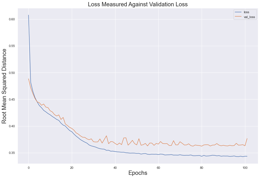
Utilizing Early Stopping, the error loss between the test set and validation set share a similar curve and slope; however, the two sets did diverge from another, suggesting over fitting.
#store history data into dataframe
model_loss = pd.DataFrame(model.history.history)
fig = model_loss.plot()

#create labels for dataframe
fig.set_title(label = 'Loss Measured Against Validation Loss', fontsize = 20)
fig.set_xlabel(xlabel = 'Epochs', fontsize = 20)
fig.set_ylabel(ylabel = 'Root Mean Squared Distance', fontsize = 20)

plt.show()
Scenario 3
model = Sequential()

#dropout to five neurons
model.add(Dense(units = 10, activation = 'relu'))
model.add(Dropout(0.50))

#dropout to five neurons
model.add(Dense(units = 10, activation = 'relu'))
model.add(Dropout(.5))

model.add(Dense(units = 1, activation = 'sigmoid'))

model.compile(loss = 'binary_crossentropy', optimizer = 'adam')
model.fit(x = x_train, y = y_train,
         epochs = 600,
         validation_data = (x_test, y_test),
         verbose = 1,
         callbacks = [early_stop])
<keras.callbacks.History at 0x14251704250>
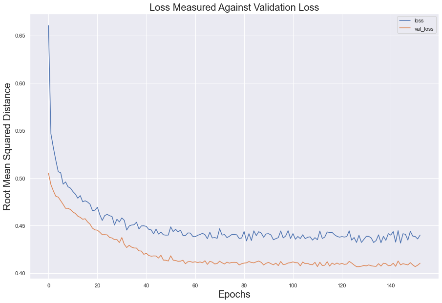
Utilizing dropouts, the model appears to have performed its best. While the error loss in the test set did not dip below 0.4, it followed the error loss in the validation set remarkable well. This suggests that the model learned from the data without overfitting or underfitting
#store history data into dataframe
model_loss = pd.DataFrame(model.history.history)
fig = model_loss.plot()

#create labels for dataframe
fig.set_title(label = 'Loss Measured Against Validation Loss', fontsize = 20)
fig.set_xlabel(xlabel = 'Epochs', fontsize = 20)
fig.set_ylabel(ylabel = 'Root Mean Squared Distance', fontsize = 20)

plt.show()
Classification Report
Per the classification report, our model learned to predict who is staying extremely well. However, the classification we cared the most about, who is leaving, earned an excellent precision score while having poor recall. This means that, out of all its attempts to identify our customer who was leaving, it misidentified them at a very low rate. However, per the recall score, it did poorly at identifying, among those who were leaving, those who were not leaving.
predictions = (model.predict(x_test) > 0.5).astype('int32')
from sklearn.metrics import classification_report
from sklearn.metrics import confusion_matrix
print(classification_report(y_test, predictions))
print(confusion_matrix(y_test, predictions))
              precision    recall  f1-score   support

           0       0.83      0.99      0.91      2401
           1       0.84      0.22      0.34       599

    accuracy                           0.84      3000
   macro avg       0.84      0.60      0.62      3000
weighted avg       0.84      0.84      0.79      3000

[[2377   24]
 [ 470  129]]
Who’s Leaving?
#feed features into predictive model
predictions2 = (model.predict(df2[['CreditScore', 'Age', 'EstimatedSalary','IsActiveMember',
                                   'Germany', 'Spain','France','Male', 'HasCrCard',
                                   'NumOfProducts']].values) > 0.5).astype('int32')
#produce array of labels
predictions2
array([[1],
       [1],
       [1],
       ...,
       [1],
       [1],
       [1]])
#capture 0's.
#ratio between 0's and 1's should be roughly 20%-25%
zeroes = []
for i in range(10000):
    if predictions2[i] == 0:
        zeroes.append(predictions2[i])
#number of "did not exit" (0) in list
len(zeroes)
21
Because of the mixed results, we decided to test the predictive capabilities of our model.
This, unfortunately, did not turn out well. Given that roughly 20% of the customer base left the bank, it stands to reason that the labeling outcomes of our prediction should roughly reflect that.
Instead, after isolating the customer’s who stayed (that is to say, all the 0 labels), we found that our model only predicted that 17 customers stayed while the other 9,983 left. This is disastrous.
We believe our model did so poorly mainly because there was no strong signal within the data. That is to say, no clear relationship emerged in our exploratory data analysis to suggest who was leaving. Women did not leave in significantly larger numbers than men; tenure did not affect a customers decision to leave; all the financial data produced a lot of noise.
Because of these weak relationships, the algorithm could not learn to identify who was leaving. It was up in the air, so to speak.
Summary
We attempted to identify the class of customer that would leave the bank based on the data provided by the bank. We attempted to use Neural Network classification to find these relationships. While our data made strong suggestions that women, Germans, and people between ages 40-50 would be more likely to leave the bank, when the numbers were crunched, the signals proved weak.
We hoped that the Neural Network model would find relationships that our exploratory data analysis couldn’t pick up. While performed well, according to the classification report, the model failed to produce the appropriate ratio of stayed/exited as found in the dataset, which was 20%.
We concluded that this was more than likely due to the weak signal within the data set. That is to say, there just wasn’t a strong association among the different features with the Exited variable. We believe perhaps a deeper neural network could contribute to success in the future. It’s possible that more instances in the data (beyond the 10,000 that we had) could have amplified any existing signal to the point where it could have been useful. If additional features in the data set could be provided (more product information, policy information, changes in interest rate, etc.) this would provide more insight as to what could have compelled the customers to leave. But for right now, we’ve learned that data quality can determine how effective machine learning (neural networks) can be.
End Notes and References
Data Source:
Eremnko, Kirill and Hadelin de Ponteves. 2018 Kaggle. Retrieved 4/9/2022 from (https://www.superdatascience.com/pages/deep-learning)
Binary Cross-Entropy:
1. Saxena, Shipra. 2021.  "Binary Cross Entropy/Log Loss for Binary Classification." Retrieved 5/10/2022 from https://www.analyticsvidhya.com/blog/2021/03/binary-cross-entropy-log-loss-for-binary-classification/

2. Harshit, Dawar. 2020 Medium. "Binary Crossentropy In Its Core!" Retrieved 5/10/2022 from  https://medium.com/analytics-vidhya/binary-crossentropy-in-its-core-35bcecf27a8a#:~:text=Binary%20Crossentropy%20is%20the%20loss,of%20classification%20of%202%20quantities
Optimizer Adam:
1. Brownlee, Jason. 2021. "Gentle Introduction to the Adam Optimizer." Retrieved 5/7/2022 from https://machinelearningmastery.com/adam-optimization-algorithm-for-deep-learning/
RMS Propagation:
1. Bushaev, Vitaly. Towards Data Science 2018. "Understanding RMSprop--Faster Neural Network Learning." Retrieved 5/7/2022 from https://towardsdatascience.com/understanding-rmsprop-faster-neural-network-learning-62e116fcf29a